Buttonを簡単にカスタマイズしたAndroidサンプルアプリ
※はじめに
この記事はAndroidアプリの開発が、初心者であるという方のための記事です。
そのため、なるべく複雑な説明は避け、コピー&ペイストですぐに動くものをご紹介します。
JavaやAndroidを理解されている方で細かい説明が必要な方は、当ブログ内の連載記事である「Android Tips」をご覧ください。
今回はButtonを簡単にカスタマイズしてみます。
ボタンの見た目はデフォルトではなく、オリジナルの画像を指定しています。
(※drawableフォルダを作成し、その中にa.png、b.png、button.xmlを配置しています。)
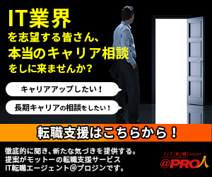
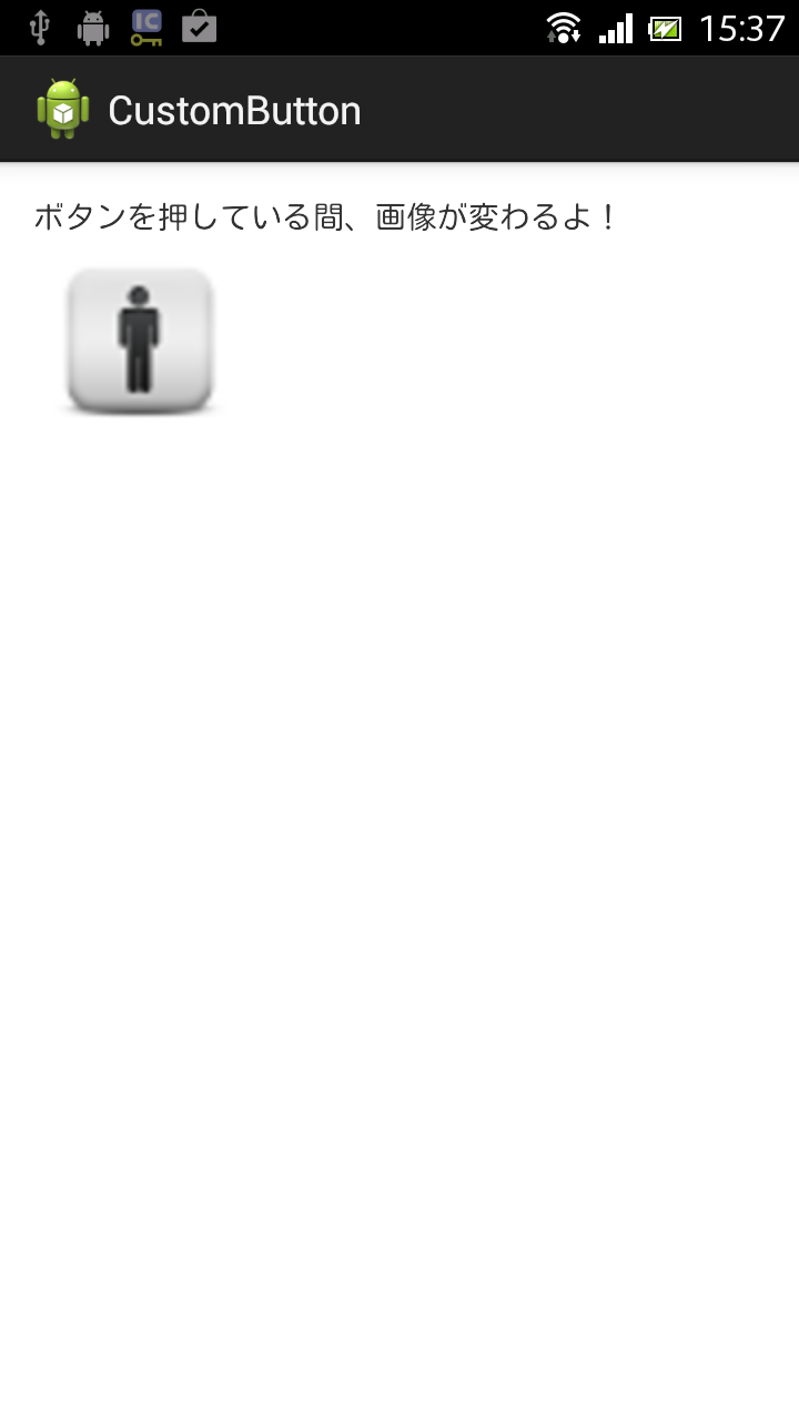
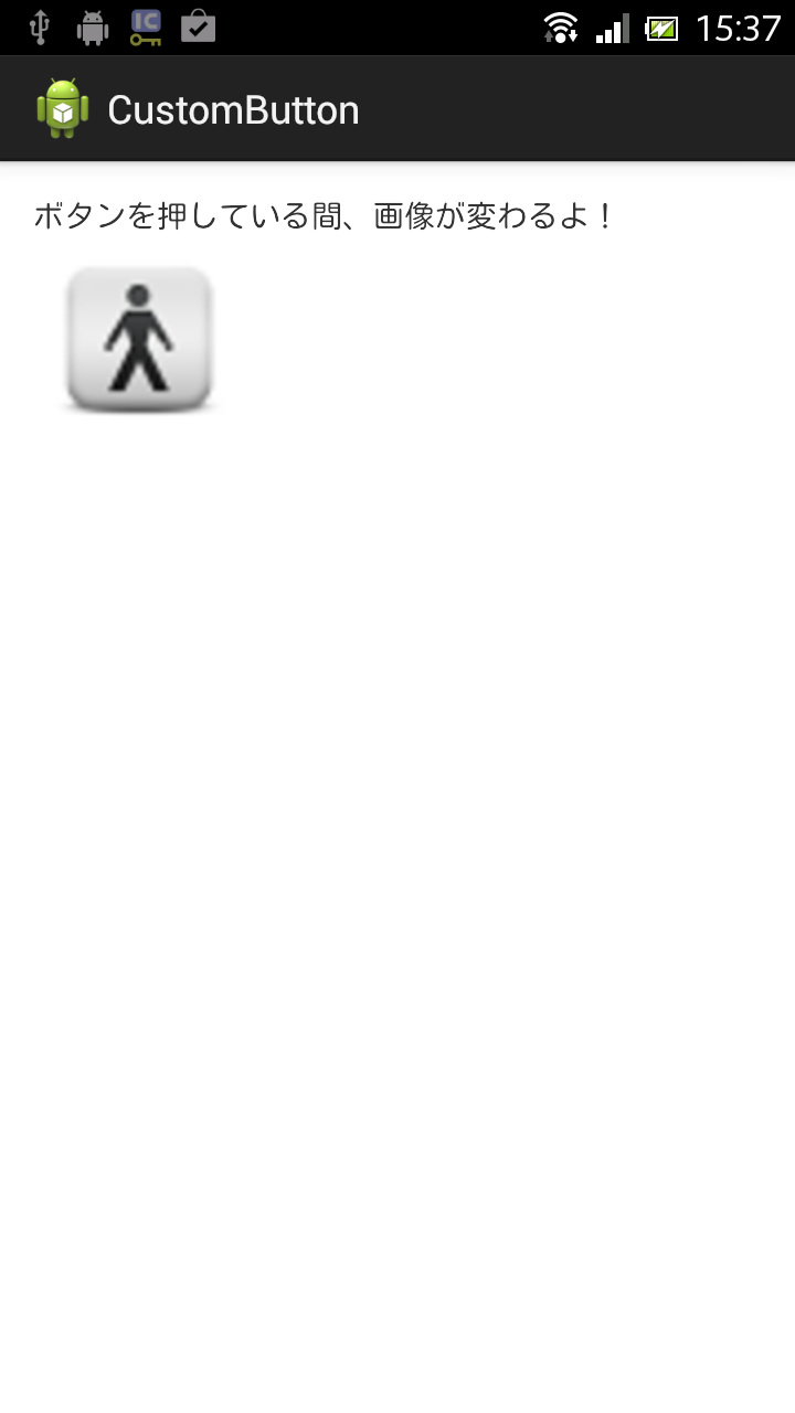
アプリ実行図
- 左図:通常
- 中央図:ボタンを押しているとき
- 右図:ボタンを離したとき
サンプルコード
- activity_main.xml
ここではButtonのバックグラウンドにdrawableフォルダ内の、button.xmlというxmlファイルを指定しています。
<LinearLayout xmlns:android="http://schemas.android.com/apk/res/android"
    xmlns:tools="http://schemas.android.com/tools"
    android:layout_width="match_parent"
    android:layout_height="match_parent"
    android:orientation="vertical"
    android:padding="15dp"
    tools:context=".MainActivity" >

    <TextView
        android:layout_width="wrap_content"
        android:layout_height="wrap_content"
        android:text="@string/hello_world" />

    <!-- android:background属性の値に、button.xmlを指定 -->
    <Button
        android:id="@+id/button1"
        android:layout_width="96dp"
        android:layout_height="96dp"
        android:background="@drawable/button" />

</LinearLayout>
button.xmlでは<selector>タグを用いて、Buttonを押している状態と、その他の状態で画像を変えています。
<?xml version="1.0" encoding="utf-8"?>
<selector xmlns:android="http://schemas.android.com/apk/res/android" >
    <!-- 押している時 -->
	<item android:state_pressed="true"
	    android:drawable="@drawable/b"></item>
	<!-- ボタンから指を離した時 -->
	<item android:state_pressed="false"
	    android:drawable="@drawable/a"></item>
</selector>
package com.example.custombutton;

import android.app.Activity;
import android.os.Bundle;
import android.view.View;
import android.view.View.OnClickListener;
import android.widget.Button;
import android.widget.Toast;

public class MainActivity extends Activity implements OnClickListener {

	@Override
	protected void onCreate(Bundle savedInstanceState) {
		super.onCreate(savedInstanceState);
		setContentView(R.layout.activity_main);

		Button button = (Button) findViewById(R.id.button1);
		button.setOnClickListener(this);
	}

	@Override
	public void onClick(View v) {
		Toast.makeText(this, "Hello!", Toast.LENGTH_SHORT).show();
	}

}
以上でOKです。