
Android Design Support libraryを使う (1)
Android Design Support libraryはAndroid Support Library 22.2で公開された、
マテリアルデザインを実現するのに便利なコンポーネントのライブラリです。
アプリのマテリアルデザイン対応を楽に進めるためにも積極的に利用したいところです。
そんなDesign Support libraryのコンポーネントの紹介と使い方の説明をしていきたいと思います。
*以下の内容の対応OSはAndroid 2.1 以上です。
導入方法
まずは何はともあれアプリへライブラリを導入をするところから。
build.gradleのdependenciesに以下の一行を追加すればOKです。
build.gradle
dependencies {
    compile 'com.android.support:design:22.2.0'
}
コンポーネント
Design Support libraryには以下のコンポーネントが用意されています。
- TextInputLayout
- FloatingActionButton
- Snackbar
- TabLayout
- NavigationView
- CoordinatorLayout
- AppBarLayout
- CollapsingToolbarLayout
まずは学習コストの低いところからとりあげていってみます。
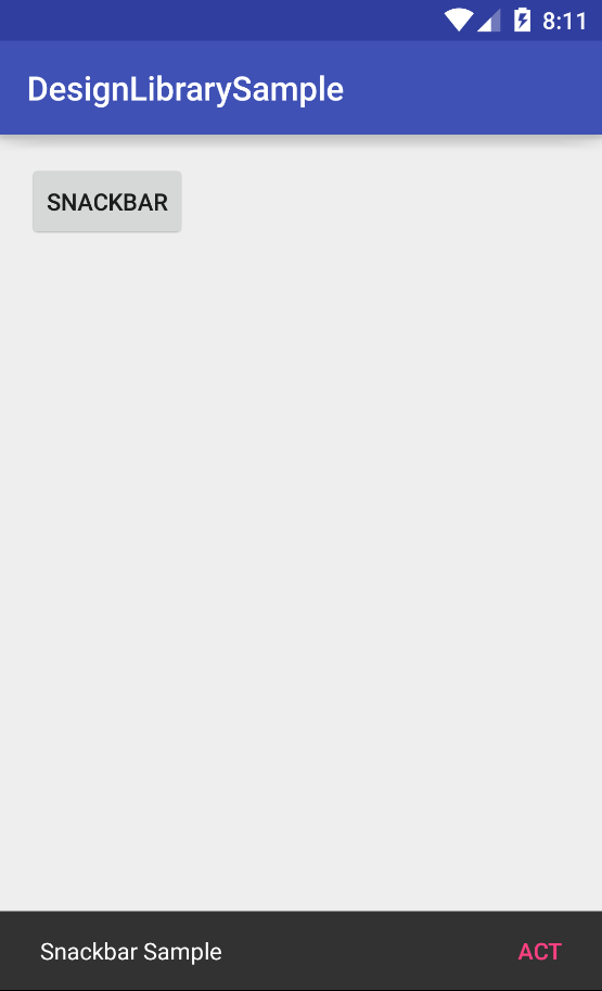
Snackbar
Snackbarとはユーザの操作に対する簡易なフィードバックを行うのに用いるコンポーネントです。
簡易なメッセージを表示できる点と、一定時間後自動的に消える挙動がToastに似ていますね。
使い方もToastに似ており簡単です。
                Snackbar.make(findViewById(android.R.id.content), "Snackbar text", Snackbar.LENGTH_LONG)
                        .show();
第一引数には親View、第二引数にはSnackbar上に表示するテキスト、第三引数には表示時間の長さ定数をとります。
上の例ではfindViewById(android.R.id.content)でActivityのroot viewを取得して与えています。
下記動画はSNACKBARボタンを押したらSnackbarが表示されるサンプルです。
SnackbarのToastとの大きな違いは、それ自体にアクションを定義できることです。
                Snackbar.make(findViewById(android.R.id.content), "Snackbar Sample", Snackbar.LENGTH_LONG)
                        .setAction("ACT", new View.OnClickListener() {
                            @Override
                            public void onClick(View v) {
                                //アクション
                            }
                        })
                        .show();
show()を呼ぶ前にsetAction()でアクションを定義します。setAction()の第一引数にはSnackbar上のボタンのテキスト、第二引数にはアクションボタンが押されたときのコールバックを与えます。
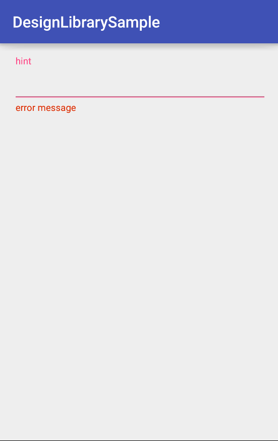
TextInputLayout
TextInputLayoutはEditTextと組み合わせてよりわかりやすい入力領域を実装するためのコンポーネントです。
従来のEditTextのhintはEditTextにフォーカスがあたると見えなくなってしまいましたが、
TextInputLayoutを用いるとフローティングラベルとして表示することができます。
また、入力エラーメッセージの表示も簡単に行えるようになります。
こちらも使い方は簡単で、EditTextをTextInputLayoutで囲んであげます。
activity_main.xml
<?xml version="1.0" encoding="utf-8"?>
<LinearLayout xmlns:android="http://schemas.android.com/apk/res/android"
    xmlns:tools="http://schemas.android.com/tools"
    xmlns:app="http://schemas.android.com/apk/res-auto"
    android:layout_width="match_parent"
    android:layout_height="match_parent"
    android:paddingBottom="@dimen/activity_vertical_margin"
    android:paddingLeft="@dimen/activity_horizontal_margin"
    android:paddingRight="@dimen/activity_horizontal_margin"
    android:paddingTop="@dimen/activity_vertical_margin"
    tools:context="jp.techpjin.designlibrarysample.MainActivity"
    android:orientation="vertical"
    android:focusableInTouchMode="true">

    <android.support.design.widget.TextInputLayout
        android:layout_width="match_parent"
        android:layout_height="wrap_content"
        android:id="@+id/text_input_layout"
        >

        <EditText
            android:layout_width="match_parent"
            android:layout_height="wrap_content"
            android:id="@+id/edit_text"
            android:hint="hint"
            android:inputType="text" />

    </android.support.design.widget.TextInputLayout>

</LinearLayout>
これによりEditTextにフォーカスが当たったときhintがふわっと上部に移動します。
エラーメッセージを表示する場合はJava側で以下のようにします。
TextInputLayout textInputLayout = (TextInputLayout)findViewById(R.id.text_input_layout);
textInputLayout.setErrorEnabled(true);
textInputLayout.setError("error message");
また、エラーメッセージを非表示に戻す場合はsetErrorEnabled(false)としてやればよいです。
TextInputLayoutのカスタマイズ
TextInputLayoutのhintフローティングラベルやエラーの表示を変更は以下の方法で行えます。
まずstyles.xmlに次のstyleを定義しておきます。
styles.xml
<style name="TextInputLayoutHint" parent="TextAppearance.AppCompat">
	<item name="android:textColor">#0021f7</item>
</style>

<style name="TextInputLayoutError" parent="TextAppearance.AppCompat">
	<item name="android:textColor">#f70000</item>
</style>
後はTextInputLayoutに属性を追加すればOKです。
<android.support.design.widget.TextInputLayout
    android:layout_width="match_parent"
    android:layout_height="wrap_content"
    android:id="@+id/text_input_layout"
    app:hintTextAppearance="@style/TextInputLayoutHint"
    app:errorTextAppearance="@style/TextInputLayoutError"
    >
まとめ
Design Support libraryの導入とSnackbarとTextInpuLayoutの使い方を紹介しました。
Snackbarはアクションをセットできる簡易メッセージ表示をするコンポーネントです。
TextInpuLayoutはEditTextをラップして入力領域を支援するコンポーネントです。
他のコンポーネントはまた記事にしたいと思います。