
AndroidのUIを作るうえで基本となる内容をまとめたいと思います。
前回の記事ではButtonの基本的な扱いについて説明を行いました。
今回はそのButtonの主に見た目をカスタマイズする方法について解説します。
背景色を変える
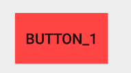
Buttonの背景を変えるにはレイアウトファイルでButtonにのandroid:background属性を指定します。
次の例では明るい赤を直接指定しています。
<Button
    android:layout_width="wrap_content"
    android:layout_height="wrap_content"
    android:text="Button_1"
    android:id="@+id/button1"
    android:background="#ffff4444"/>
形を変える
Buttonの形を変えたい場合、res/drawable/以下に形を定義するxmlファイルを作成します。
次の例ではbutton_background.xmlを作成します。ルート要素(root element)はにしてください。
button_background.xml
<?xml version="1.0" encoding="utf-8"?>
<shape xmlns:android="http://schemas.android.com/apk/res/android"
    android:shape="rectangle">
    <solid android:color="#ffff4444"/>

    <corners android:radius="8dp"/>

    <stroke
        android:color="#ffffff"
        android:width="2dp"/>

</shape>
このxmlをButtonのandroid:backgroundに指定します。
<Button
    android:layout_width="wrap_content"
    android:layout_height="wrap_content"
    android:text="Button_1"
    android:id="@+id/button1"
    android:background="@drawable/button_background"/>
このButtonは以下のような見た目になります。
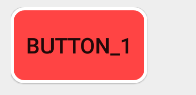
さてbutton_backgroudn.xmlについてもう少し詳しく説明していきましょう。
ルート要素であるshapeはandroid:shape属性を持っています。android:shape属性には以下の形状を指定できます。
| rectangle | 長方形。デフォルトの形 |
| oval | 楕円形 |
| ring | 円形 |
| line | 線形 |
次に子要素についてです。
要素はandroid:colorを指定することでButtonの塗りつぶし背景色を決めます。
要素は、がrectangleのときのみ適用される要素です。android:radiusを指定することで角の丸みを指定できます。値が大きいほど丸みを帯びた角になります。
要素はButtonの輪郭線を定義できます。android:colorで色を、android:widthで線幅を指定できます。
また、子要素として他に、色のグラデーションを作る要素や大きさを決める、paddingを決める要素などもあります。
状態に応じて表示を変える
さて、今までの例ではボタンの色はユーザが触れていようが無効状態だろうが変わりません。
ボタンの状態に応じて見た目を変えたい場合があると思います。以下でその方法について説明します。
まずは上の要領でdrawable/に、状態に応じたルートのxmlファイルを作成します。
今回はデフォルト(button_default)、クリック時(button_pressed)、無効時(button_disabled)の3状態を考えます。
button_default.xml
<?xml version="1.0" encoding="utf-8"?>
<shape xmlns:android="http://schemas.android.com/apk/res/android"
    android:shape="rectangle">
    <solid android:color="#ffff4444"/>

    <corners android:radius="8dp"/>

    <stroke
        android:color="#ffffff"
        android:width="2dp"/>

</shape>
button_pressed.xml
<?xml version="1.0" encoding="utf-8"?>
<shape xmlns:android="http://schemas.android.com/apk/res/android"
    android:shape="rectangle">
    <solid android:color="#ff33b5e5"/>

    <corners android:radius="8dp"/>

    <stroke
        android:color="#ffffff"
        android:width="2dp"/>

</shape>
button_disabled.xml
<?xml version="1.0" encoding="utf-8"?>
<shape xmlns:android="http://schemas.android.com/apk/res/android"
    android:shape="rectangle">
    <solid android:color="#cccccc"/>

    <corners android:radius="8dp"/>

    <stroke
        android:color="#ffffff"
        android:width="2dp"/>

</shape>
次にdrawabled/にルート要素でbutton_state.xmlを作成し以下のように記述します。
button_state.xml
<?xml version="1.0" encoding="utf-8"?>
<selector xmlns:android="http://schemas.android.com/apk/res/android">
    <item android:drawable="@drawable/button_disabled"
        android:state_enabled="false"/>
    <item android:drawable="@drawable/button_pressed"
        android:state_pressed="true"
        android:state_enabled="true"/>
    <item android:drawable="@drawable/button_default"
        android:state_pressed="false"
        android:state_enabled="true"/>
</selector>
最後にこのbutton_stateをButtonのandroid:background属性に指定します。
<Button
    android:layout_width="wrap_content"
    android:layout_height="wrap_content"
    android:text="Button_1"
    android:id="@+id/button1"
    android:background="@drawable/button_state"/>
結果・・・
通常時
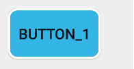
クリック時
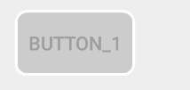
無効時
状態に応じてButtonの見た目を変化させることができるようになりました。
Buttonの基本的なカスタマイズ方法は以上です。